5 Tips For Designing In Dark Mode
Dark Mode has been around longer than you might think. In fact, the world’s first computers used dark mode by default because screen lighting technology wasn’t efficient enough to light up the entire screen without burning. A dark mode user interface has become a common preference for both web and app users, and dark theme design has become a popular design style, especially in the tech industry.
Designing in dark mode
Dark mode
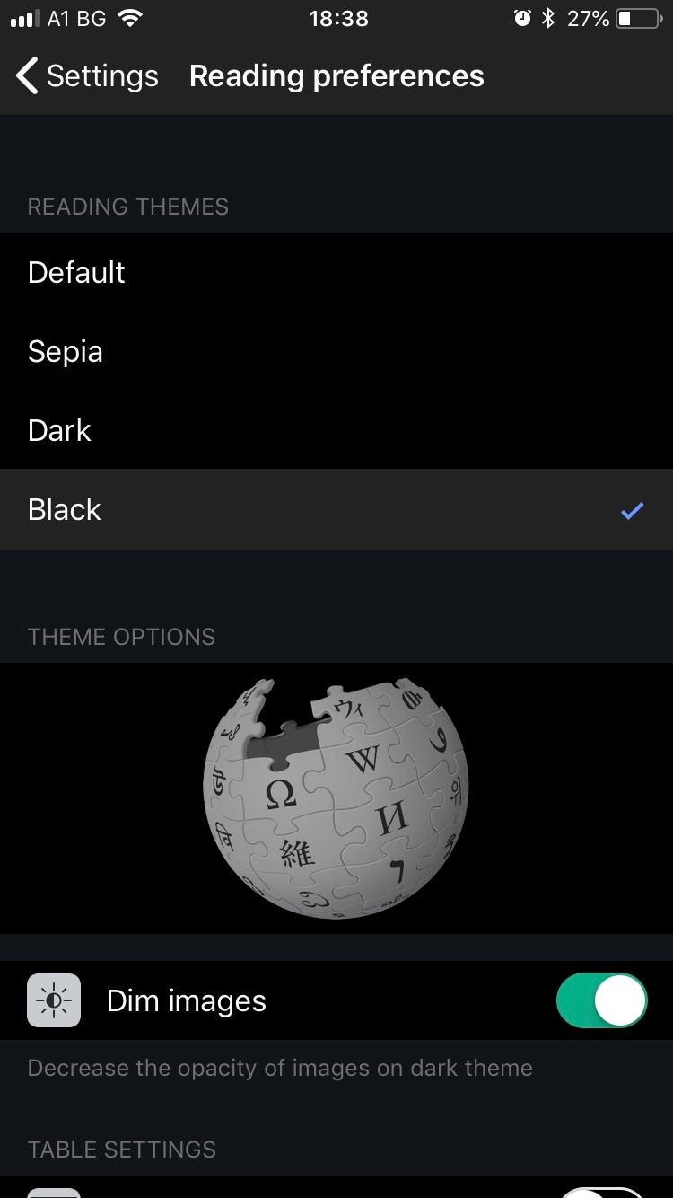
Dark Mode is a user interface design theme that displays light text on a black background instead of the traditional black text on a white background. Both Google and Apple computers and mobile devices offer a dark mode setting that allows users to switch between light and dark themes.

Difference between dark mode and dark theme web design
The rise of dark mode has also created a demand for dark themed website design that uses the same concept as dark mode display. The two concepts are often considered the same, but in simple terms – dark mode uses a preset dark theme design throughout the device interface.
This design approach is popular for several key reasons:
It can complement your brand’s style – A dark themed design often complements brands with vibrant color palettes and can give you a striking canvas on which to tell your brand story.
Helps users focus – A darker background can act as a dramatic canvas to draw users’ attention to key elements of design and copy.
It’s unique – Although dark design is popular, most websites use light design and many of them can start to look the same. Branching out into dark topics can help your brand stand out from your competitors.
5 tips for designing a dark theme
-
Consider your brand
A dark background is not for every brand. So before you invest time and resources into creating a dark themed UI design, consider your brand story, brand character, and color palette.
-
Avoid pure black
A dark theme design does not require a pure black background. In fact, dark gray can achieve the same look and feel as pure black, but can soften the contrast between text and background, making it easier for users to focus. A dark gray background also allows you to use a wider range of colors in your design and achieve more depth with shadows and gradients.
-
Avoid strongly saturated colors
The more saturated the color, the cleaner it will be. The less saturated it is, the gray it will appear. Deep colors look great on a light background, a brilliant royal blue on a white background. But place this blue against a dark background and it can be difficult to read, causing the reader to struggle to see it clearly.
-
Make sure there is enough contrast in your colors
Color contrast is key in dark mode and dark theme design, as your background must be dark enough to make white text easy to read. Contrast is defined as the ratio of one color to another. Not enough contrast and your design will look dark and confused. Too much contrast and your lighter elements can appear to glow and provide a jarring visual experience.
-
Soften the white background
Just like a dark background doesn’t have to be pure black, your white background doesn’t have to be white Crest White Strips. If the whites are too bright, they can shine on a dark background and create a distracting visual experience for the user.
Conclusion
When done well, a dark theme web design can be stunning and incredibly effective at capturing the attention of your audience.


